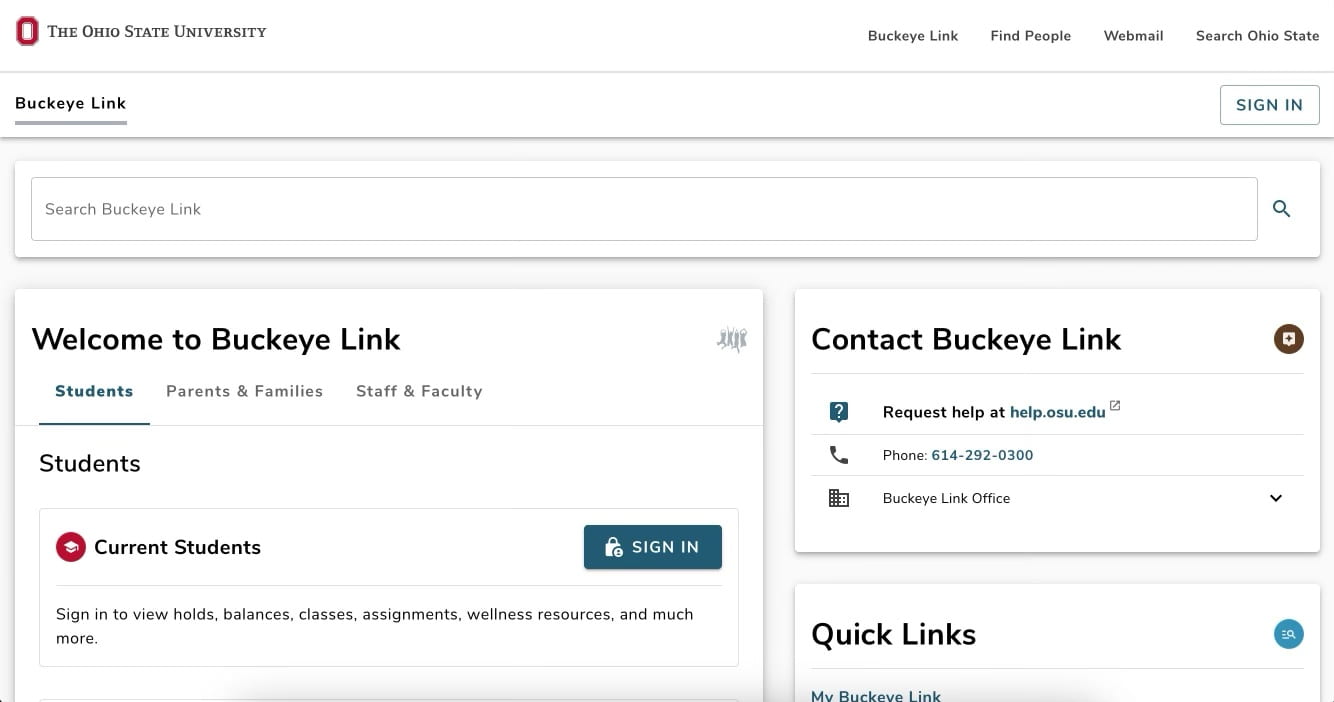
Updated Buckeyelink provides a new dashboard look. Credit: Charlotte Huot | Lantern Reporter
As students schedule for the spring semester, they’re greeted by a new Buckeye Link page.
The upgrade includes a personalized dashboard with quick links to My Buckeye Link, university spokesperson Chris Booker said. The change was co-led by Strategic Enrollment Management and the Office of Digital Technology and Innovation — ODTI — in order to provide students better access to information in order to manage their accounts.
“Our goal is to save students time and to make it easier for them to be successful,” Ben Hancock, ODTI’s director of applications development, said.
The change to the website came after a University Student Government survey where students expressed concerns with navigating the website, Tiffany Hsich, USG member and senior initiative counselor to the executives, said.
Concerns regarding the website included difficulties scheduling classes, navigating financial aid and to-do items, outdated visual appeal, glitches and problems with searching, according to the survey.
“While working as USG’s director of the Academic Affairs Committee last year, it quickly became clear that many students across OSU found Buckeye Link to be outdated and confusing to navigate,” Hsich said.
Through this feedback, the university determined what a new Buckeye Link should include. According to Ohio State News, Sam Falcone, a Strategic Enrollment Management senior systems analyst, said students, staff and faculty were involved in the whole redesign process.
“We’ve engaged students at every level as well as staff and faculty,” Falcone said. “We’ve conducted focus groups, individual interviews and we’ve looked at surveys as well as getting feedback from the Ohio State mobile app. What do students want? What do they need? What do they like? What’s helpful?”


